Agency: Knightsbridge Technologies
Client: Mercer Oak Law
Client: Mercer Oak Law
Mercer Oak is a law firm based in Chicago, IL. It was founded to leverage business and legal skills to better serve clients and to provide the close attention and predictability they deserve.
The founding partners met at Princeton University and wanted a logo and name that represented that time and their friendship.
They decided on the name Mercer Oak and the tree which stood for approximately 300 years in Princeton, New Jersey. It was named after a brigadier general under George Washington during the American Revolution. In January 1777, General Hugh Mercer was stabbed by an English Soldier and found refuge under this tree during the Battle of Princeton.
Round 1: The client wanted the logo to be a tree with leaves and an intertwined trunk to signify their protective relationship with clients.
The Inspiration.
A serif font was used to give a classic look with heritage. Initial designs are in black and white so that we can focus on the logo shape, avoiding distractions of color choices.


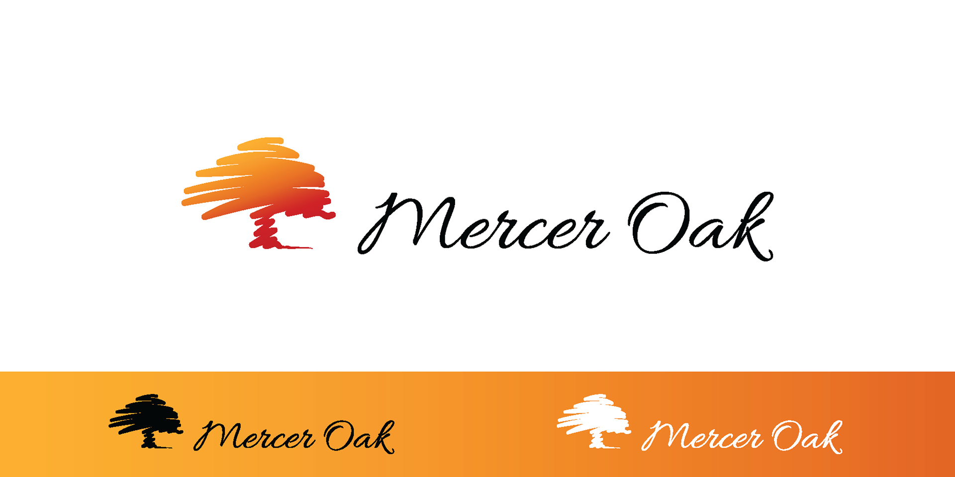
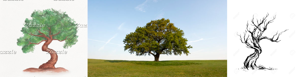
Round 2: The client liked the initial direction based on their specific requests. They asked me to create a couple of additional abstract concepts without restrictions. I had some fun and came up with these three designs, along with testing additional font styles. I imagined the first two being very flexible with color choices and scale. The third was inspired by a quick stylus-drawn mockup based on a photo of a real Oak. It felt right. It felt clean. The client loved this version.


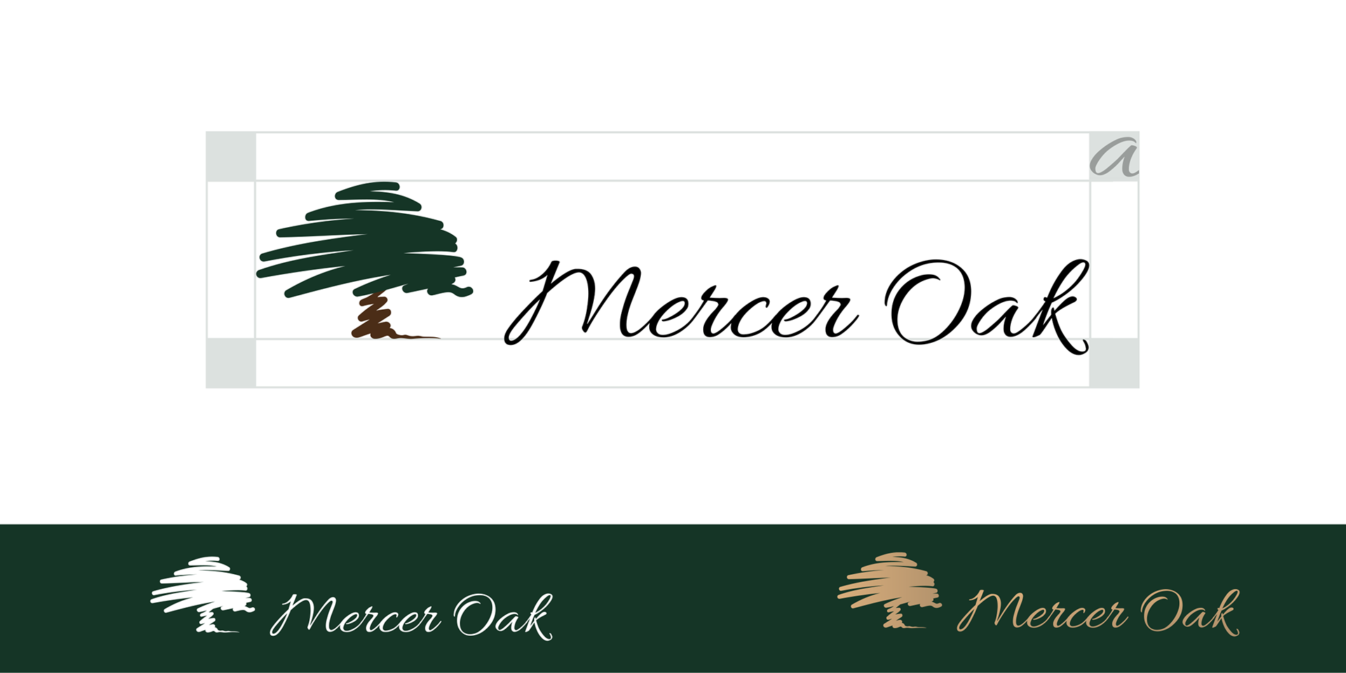
Round 3: For the selected logo, I felt the tree trunk needed more work to showcase the intertwined part, so I put together a few variations to see what else might work. The thin lines worked for large format, but are lost when small shrunk down. The final was a continuation of the hand-drawn top portion.


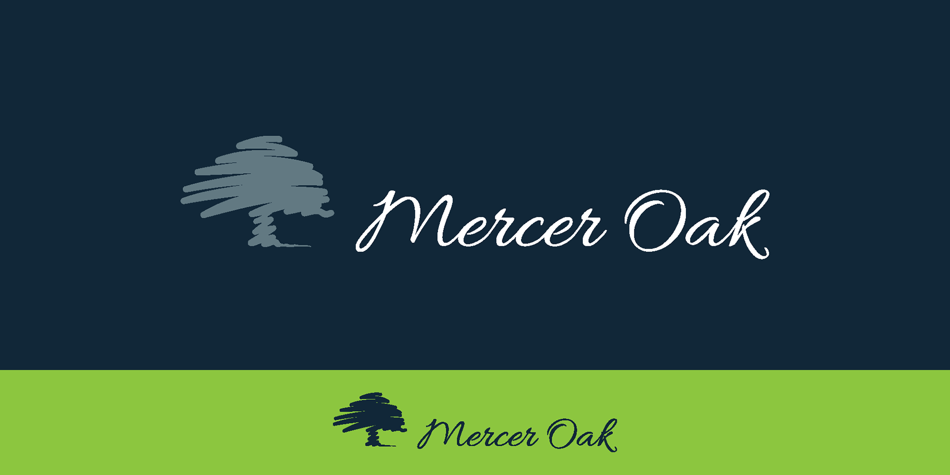
Color Exploration: We explored many color palettes, with some seasonal color gradients and some modern color combinations. The colors that were favored most were traditional green & brown, with an optional Gold Specialty Version for use on dark backgrounds as an alternative to white.