Agency: Knightsbridge Technologies
Client: Ivy Lane Counseling
Client: Ivy Lane Counseling
Located in Naperville, IL, Ivy Lane Counseling provides therapy and counseling services that get to the root cause and set you up for future success.
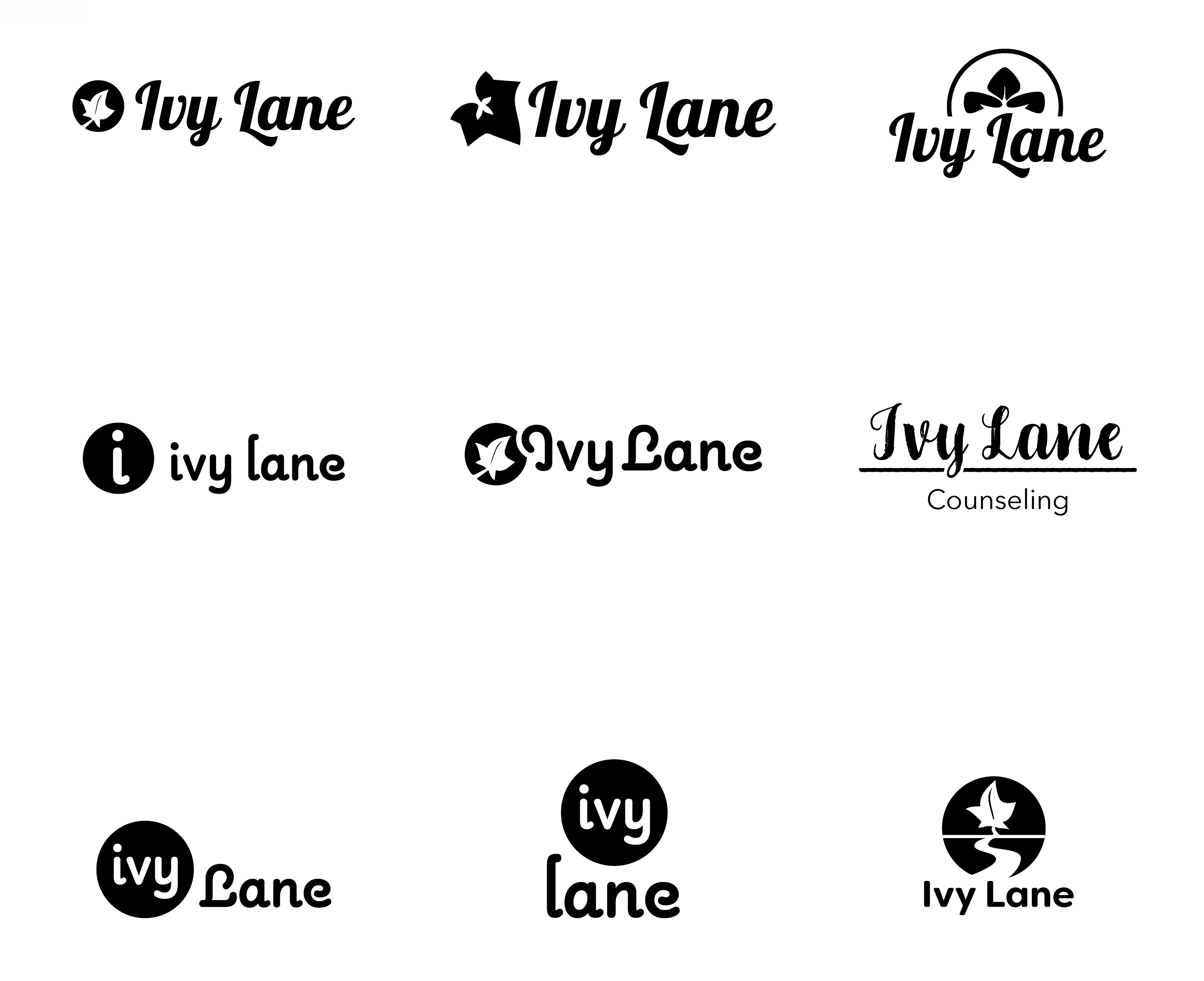
Round 1: The client sought a logo that made them feel approachable and modern. Hand-written style fonts were proposed for this look. The client wanted to incorporate a leaf into the logo to symbolize hope, abundance, growth, and rebirth. Unsure if they wanted to include 'counseling' in the logo, we mocked up a few with and without.
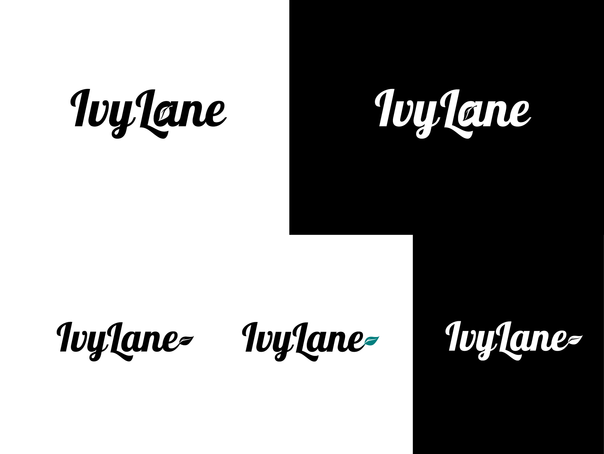
Round 2: The client loved our first round of designs, but was drawn to the font used on the top row. Incorporating a leaf into the design was our next goal.
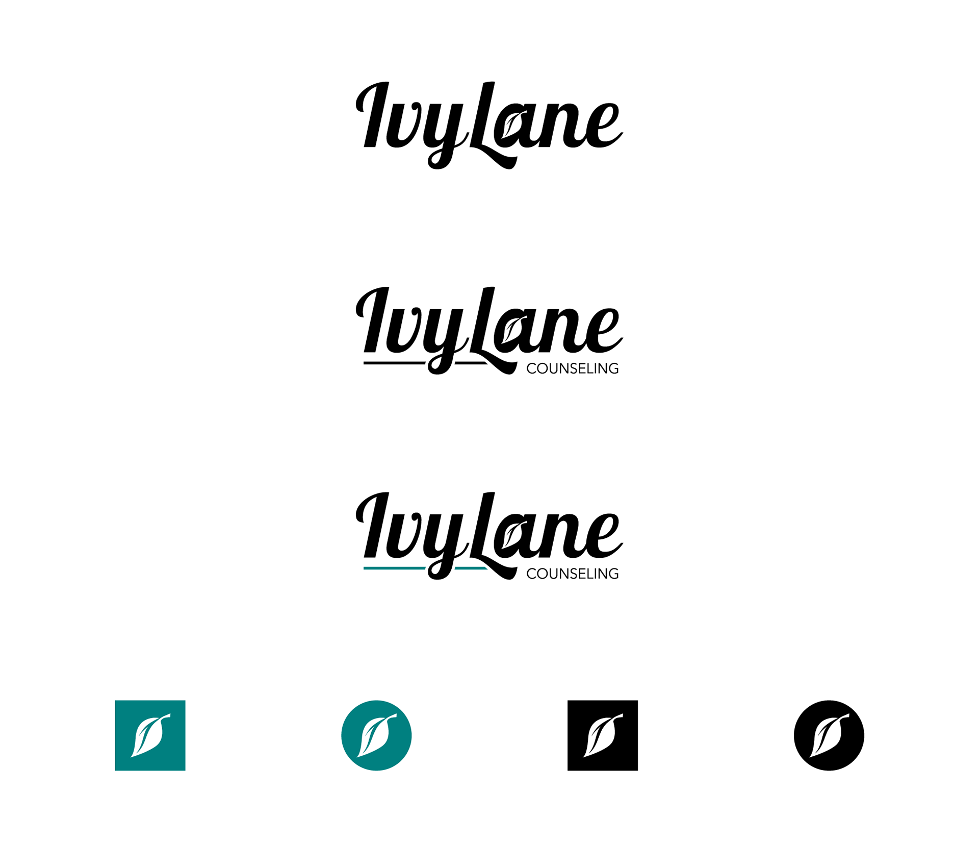
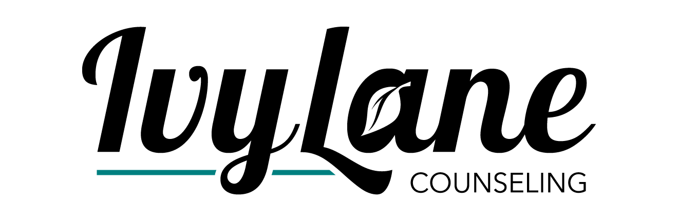
Round 3: The client selected the top design. After some fine-tuning, like removing the serif from the 'L' for readability, the final logo emerged. The client chose to have a version with and without the word 'counseling' to use for various purposes. The teal accent color was the original color proposed, along with a couple of different shades.